Designing an Immersive Musical
Posted on October 12, 2018
by
We sat down with Nick Blais, one of the incredible designers for Dr. Silver: A Celebration of Life, to discuss the unique and immersive design for our inaugural co-production with immersive leaders Outside the March.
Don’t miss #DrSilverTO, onstage at Heliconian Hall until October 21!
How did you find the Heliconian Hall and why was it chosen as the location for Dr. Silver?
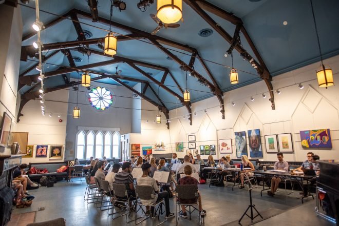
There was actually another venue nearby that we came to look for this show in the area. I can’t recall if we stumbled across Heliconian Hall that day or if director Mitchell Cushman had already known about it. The building, inside and out, had an odd kind of beauty and a neutral sense of community/worship that seemed appropriate for the kind of fictional community we were trying to create. The exterior of the building is so unique and fitting for our purposes. It was a combination of hard work and fate that we ended up there.
What can audiences expect from the space?
Audiences can expect us to transport them somewhere new and unexpected. While the venue already provides a great gathering space for this story’s characters (and the audience), we have designed/ transformed it with the specific purpose of celebrating the life of Dr. Silver and his beliefs.

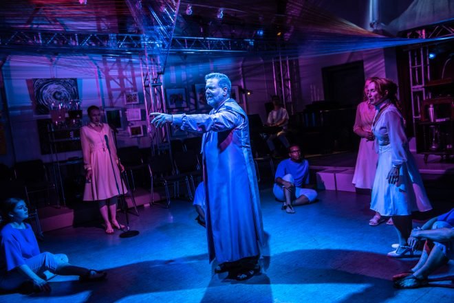
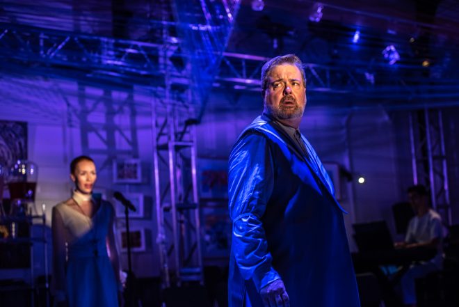
Donna Garner, Peter Deiwick, Bruce Dow & Rielle Braid. Photo by Dahlia Katz. Production Design by Nick Blais, Anahita Dehbonehie and Ken MacKenzie. Video Design by Nick Bottomley.
You design in venues both traditional and surprising, how does designing for a non-traditional venue work?
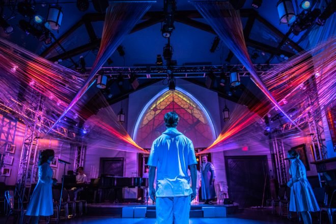
Designing in a non-traditional venue is a blessing and a challenge. The venue always makes ‘an offer’ to the type of show you’re going to do, certainly to the general aesthetic. The wrestle usually comes from trying to balance altering the space to fit the story vs. tailoring the story to fit within the space. Ignoring what the space has to offer is a difficult approach creatively (and for the budget). Any kind of temporary installation can’t beat real, living architecture. Your only hope is to work with it. A challenge on Dr. Silver was creating a thematic sculpture for the show inside the essential and functional structure of our truss system inside yet again the impressive but untouchable architecture of the space. All three had to not only coexist but compliment each other. Ultimately non-traditional venue design requires a different non-traditional approach to design. It makes the process new and exciting each time.

Kira Guloien, Bruce Dow, Donna Garner & Rielle Braid. Photo by Dahlia Katz. Production Design by Nick Blais, Anahita Dehbonehie and Ken MacKenzie. Video Design by Nick Bottomley.
Can you talk about your design process? Does it change when you’re working on a piece currently in-development?
My design process is a lot of collaboration and percolation. Because this process has been in the works for a number of years there was plenty of time to throw ideas around and bank inspiration until we were moving into production. Once we set dates though, it was a race towards the finish line, not because we didn’t have time but because there were a lot of exciting avenues to explore aesthetically and thematically to make sure we found the best ones. In some ways we had to create an aesthetic that would lend itself to potential change as the piece transformed, but at the same time I feel like making big design offers while the story was being developed has lead us down a really exciting aesthetic path for the production.

Bruce Dow. Photo by Dahlia Katz. Production Design by Nick Blais, Anahita Dehbonehie and Ken MacKenzie. Video Design by Nick Bottomley.
How does designing for a musical differ than a straight play?
There are lots of differences but I believe the central objective is the same. To provide visual and thematic support to the story, its characters, and its purpose. The biggest difference, but also benefit, is that you have this amazing collaborator from the very beginning when you’re given the music. It is the best research library to reference when designing. The music offers so much – theme, composition, and theatrical mood just by listening to it. A straight play obviously has a script that you begin from which makes similar offers, but a musical quite literally sets the pace and the tone for the entire production.

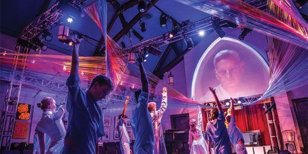
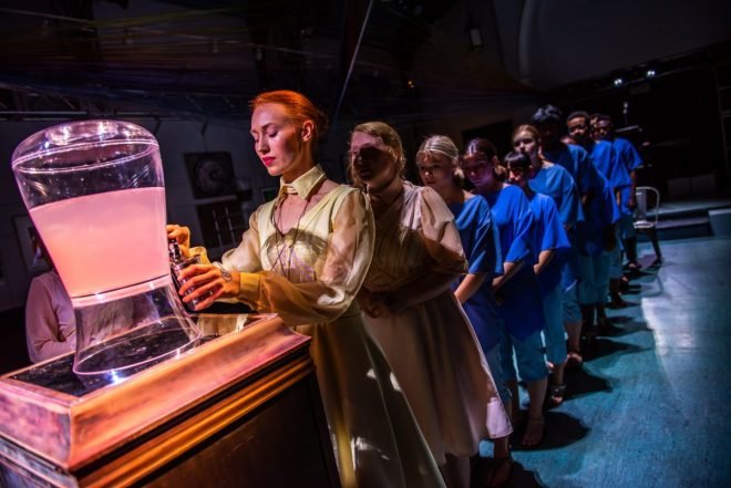
Kira Guloien, Rielle Braid and the Edge of the Sky Young Company from Wexford Collegiate. Photo by Dahlia Katz. Production Design by Nick Blais, Anahita Dehbonehie and Ken MacKenzie. Video Design by Nick Bottomley.
This production has a design team instead of individual roles (costumes, set, props, lighting), can you talk about the collaboration process between the designers?
Ani, Bottomley, Ken and myself all have very different approaches to design. That is what this project needed. Building a visual language for a show that worships sound, navigating a new venue, all while developing a new work, required all designers working together to make the most effective production. It was important that we all had input into all elements early on to sculpt the best possible version of the show. While production design is traditionally done by one person, Ani, Ken and I have worked together closely a number of times. We knew that at one point we would have to start dividing things up but that led to the most effect part of the collaboration: where each of our unique approaches to design allowed us to divide up the deliverables for each design element that made the most sense for each of our individual skill sets.
